Posts

Push the button and let me code ♫

Image
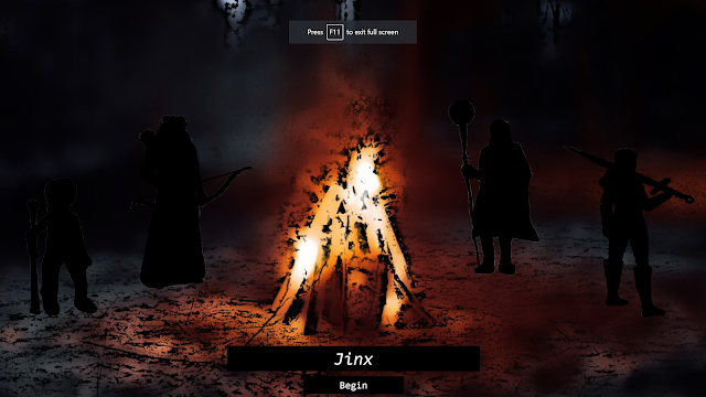
       Username input field? Check.      Shiny enter button? Check.     Enter username: Username "Jinx":      I had to make some edits to my code again, but it feels good to make the changes knowing I'm learning each time how to improve. I'm aware my character is looking a little tiny, but she is meant to be a dwarf so I hope it won't look quite as disproportionate when I have the other characters uploaded.      I messed around a little with the design on the entry field and button. I tried different colours, different levels of transparency, different fonts. I'm really happy with what I have now. I already knew that I wanted to set up each layer of the game with a black text box for users to type code into, so it would feel visually similar to command prompt, and I think this page is a good reflection of that.     ( Very aware that I just started every line in the last 2 paragraphs with an "I". Oi.) I think I'll try to finish another character t

We're ready for the afterglow ♫

Image
       As I suspected, my art sucked. Then I had 'The Idea'.       Outlines .      No art needed, no details to waste hours getting lost in. I got one done in 10 minutes, created a sticker, saved it as a PNG and stuck it on the website. The challenging part was figuring out how to position it where I wanted, but I got the sizing down and the position and I feel like I learned something. The information just sticks better when I'm using the tools in practice.      I also learned that the code I previously had for my background wasn't compatible for some browsers. So I spent a bit of time looking into CSS code to see how to replace the "webkit filter" I had, and actually managed to do so.      But that's not all. Overachiever? Why, yes, I do believe so.      I was on a roll, so I pieced together and studied bits of code to put together a hover effect on my character image.       It fricking glows. Whee! Pre-glow:     Post-glow: Link to HTML code Link to CSS

This, background's on fi-yaaaaaaaa! ♫

Image
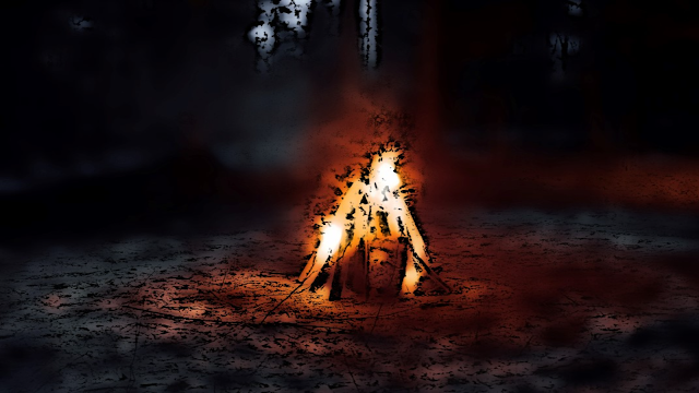
    I did it! I have a background! Whee!      It took a bit of trial and error and a few google searches but I have a background that fills the screen. I took the original image, cartoonified it, cropped it into a wide image and voila. Screenshot of webpage in full screen:     I will probably have to fiddle with the sizing a bit more when I upload characters to lay over it, but I'm kind of proud of just this baby step. My frustration tolerance was below 0 today so I think I did well to get this done.     Next up, I need to add a text box for users to enter their name/username. I think I'll put it at the bottom, under the fire, with the characters in various poses to the right and left of the flames. I said 5 characters, but I might cut it to 4 for even numbers. And it's probably less important right now, I can add more details later. Must remember not to get sucked into details!     Also, I came up with a way to remember the syntax needed for CSS ruleset selectors for class

A little less complicated, a little more coding, please. ♫

          Okay, so selecting an individual character is going to be pushed back to the "add later" pile.     As of now, I have an image to use as the background (an amazing campfire photo) and a "cartooned" version of it. I will study how they both look once I have rough images of the characters to add, but I imagine it will look more visually blended if I don't have sketches laid over real life backgrounds.     I need to figure out how to make the image fill the whole screen but remain centred, so that's task one. I haven't finished HTML lessons yet, and I believe CSS is needed to complete this task, so for the time being it's back to studying for me.

Rough draft

  Home page:     Something to visually introduce the characters and set the tone for what the website is about. (Fantasy, adventure, etc) Maybe a campfire, night setting with the characters gathered around the flames with their armour and weapons.     A welcome message and a text box for "players" to input their name.     A selection process after a name is entered, where users can chose a character. Cycle through choices? Backstories? All details to add once the skeleton design is made. Can't get too hung up on these details just yet. Next page:     A dialogue scene. Maybe the user is new to the group and there's some back and forth about the groups destination. Maybe try to implement a response by having the user print() some dialogue. To make it match the dialogue and semi-script, the answers should be pre-chosen and the user has to insert them into a print() statement, like games with multiple choice interaction. Too complicated to do unique responses to different

New Blog, who this?

Okay. First blog. So, future me, let's create "Dungeon Code".      Brief outline (because your memory is atrocious): Dungeon Code will be an interactive game of sorts, inspired heavily by your love of Critical Role and fantasy. Because you struggle with concentration, and therefore staying focused on learning, this will hopefully be something you can work on to implement what you've learned and cement the knowledge in your brain, and make remembering coding languages a lot easier (and fun). Dungeon Code will be a set up of fantasy characters, namely a group of 4 alongside the main character (the user). As you are known to go off on tangents and focus too heavily on the details before creating the main skeleton of the beast, the focus will be on how each lesson in a language (Python, being as that's what you learned first) can be implemented as an element in the fantasy. One quick example: spells. For a spellcasting character, they would need components to cast